The Growing Divide: Red States vs. Blue States
The following is an interactive dashboard exploring how the relationship between party control of state government and various well-being metrics has evolved over the last 20 years. This is part 2 of a multi-part series of visualizations and analyses exploring this topic.
The dashboard, along with a short accompanying piece, was published by the Georgetown Public Policy Review in February 2020. The link to that publication can be found here.
The data and code used in this analysis can be found here.
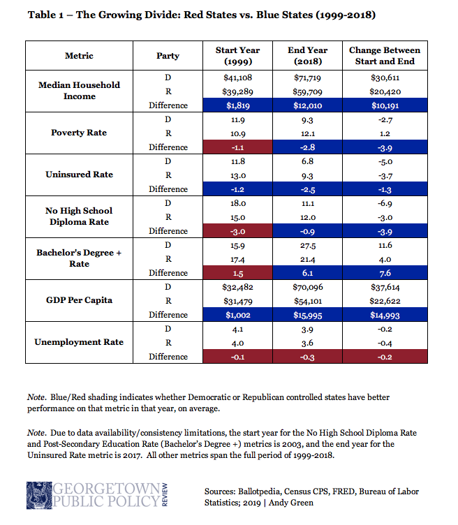
Additionally, the following table provides a numerical summary of the trends displayed in the dashboard:
